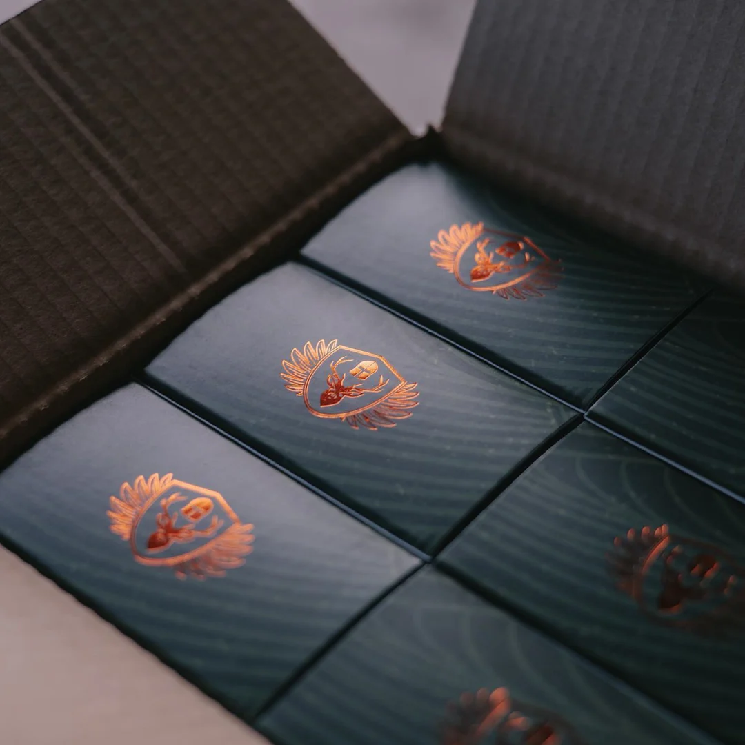
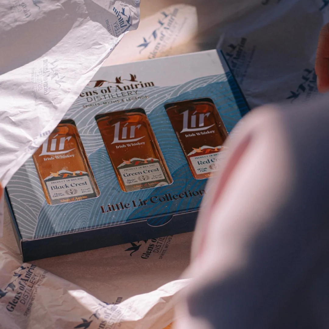
Creating a new Irish whiskey brand is one of those dream briefs that doesn’t come along every day – and one that we eagerly embraced. Working with Glens of Antrim Distillery, Morrows’ creative team developed the brand mark, bottle design, and packaging for Lir Irish Whiskey.
Lir Irish Whiskey takes its name from the ancient Irish legend of the Children of Lir. According to the myth, King Lir’s second wife, jealous of his love for his four children, cast a spell that transformed each of them into a swan for 900 years. The first 300 years were spent on Lake Derravaragh, the next 300 on the Straits of Moyle, and the final 300 on the Isle of Inishglora.
The Glens of Antrim is rich in Irish folklore, where spirits, myths and legends meet. Lir Irish Whiskey pays homage to these stories, and this lore became the foundation for our creative direction. Our brief was clear: create a brand that embodies the spirit of Irish mythology, stands out in a crowded market, and resonates with both younger whiskey drinkers and those with more established palettes.
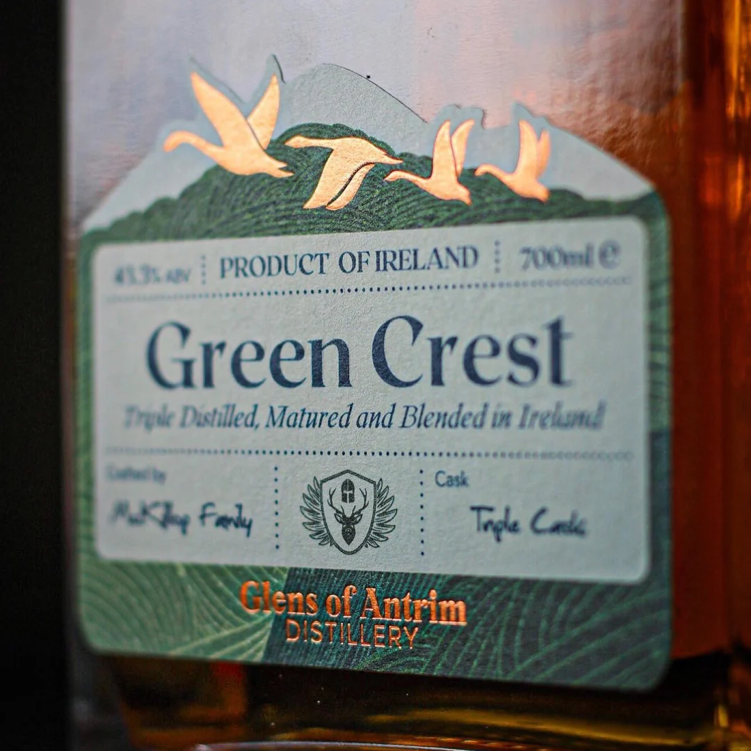
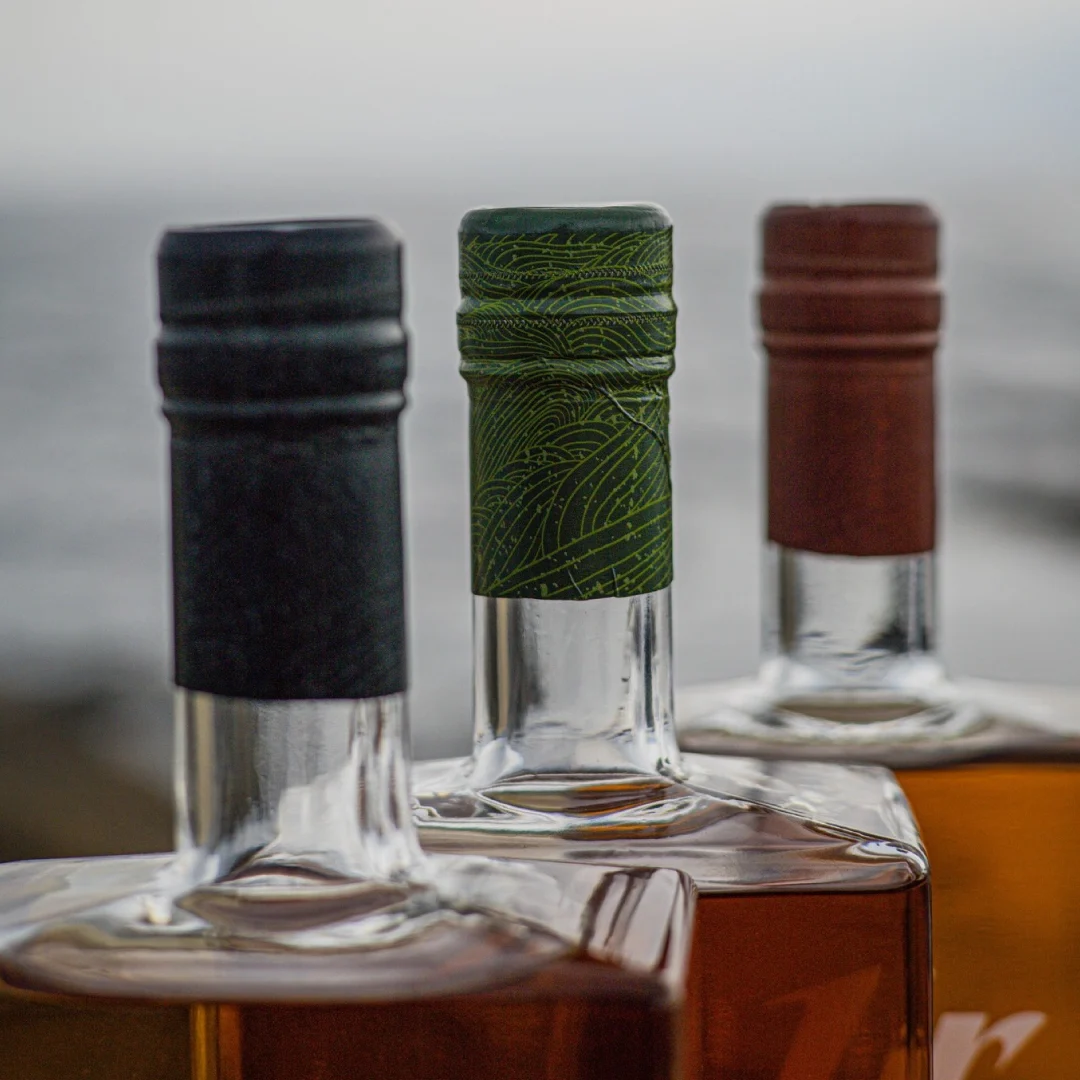
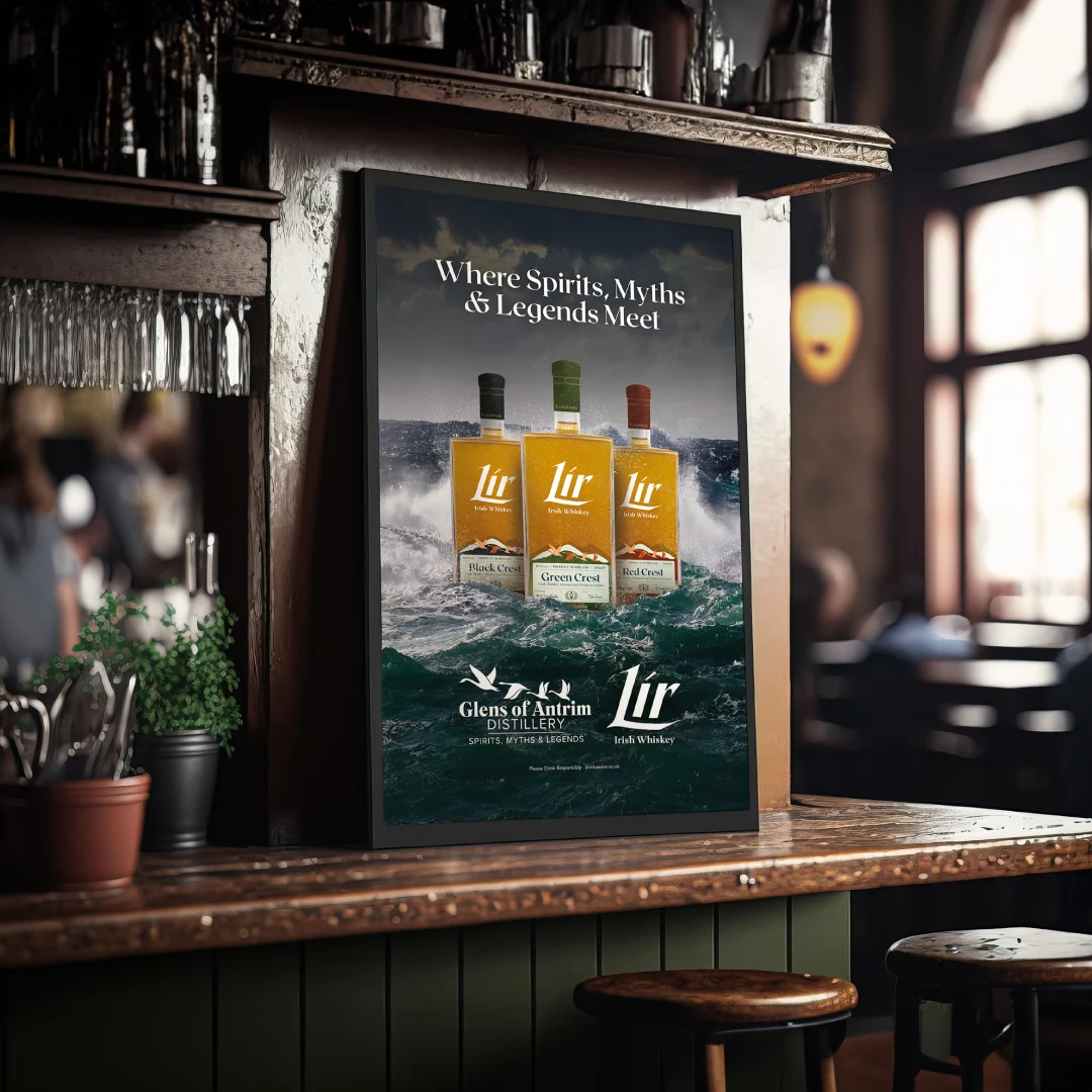
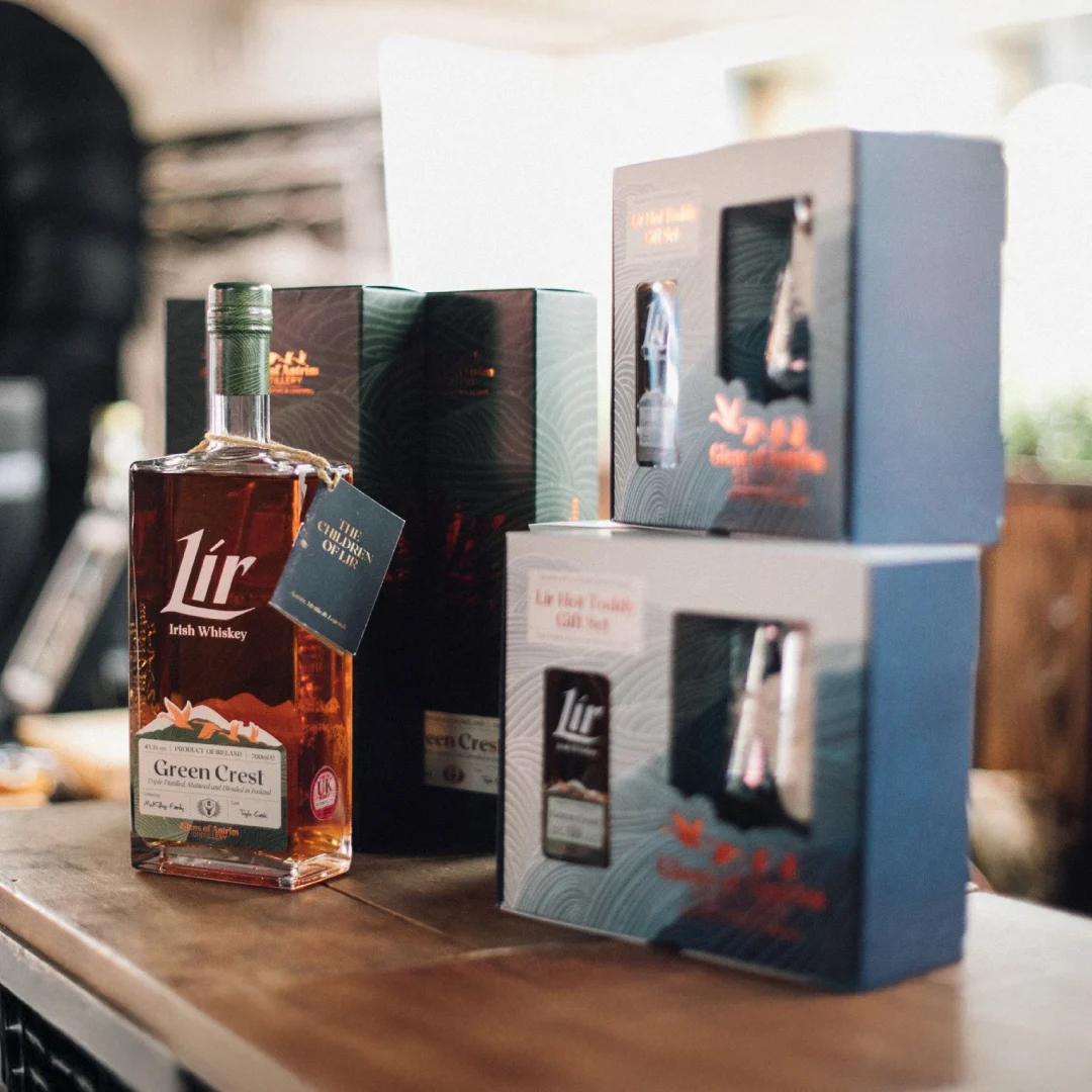
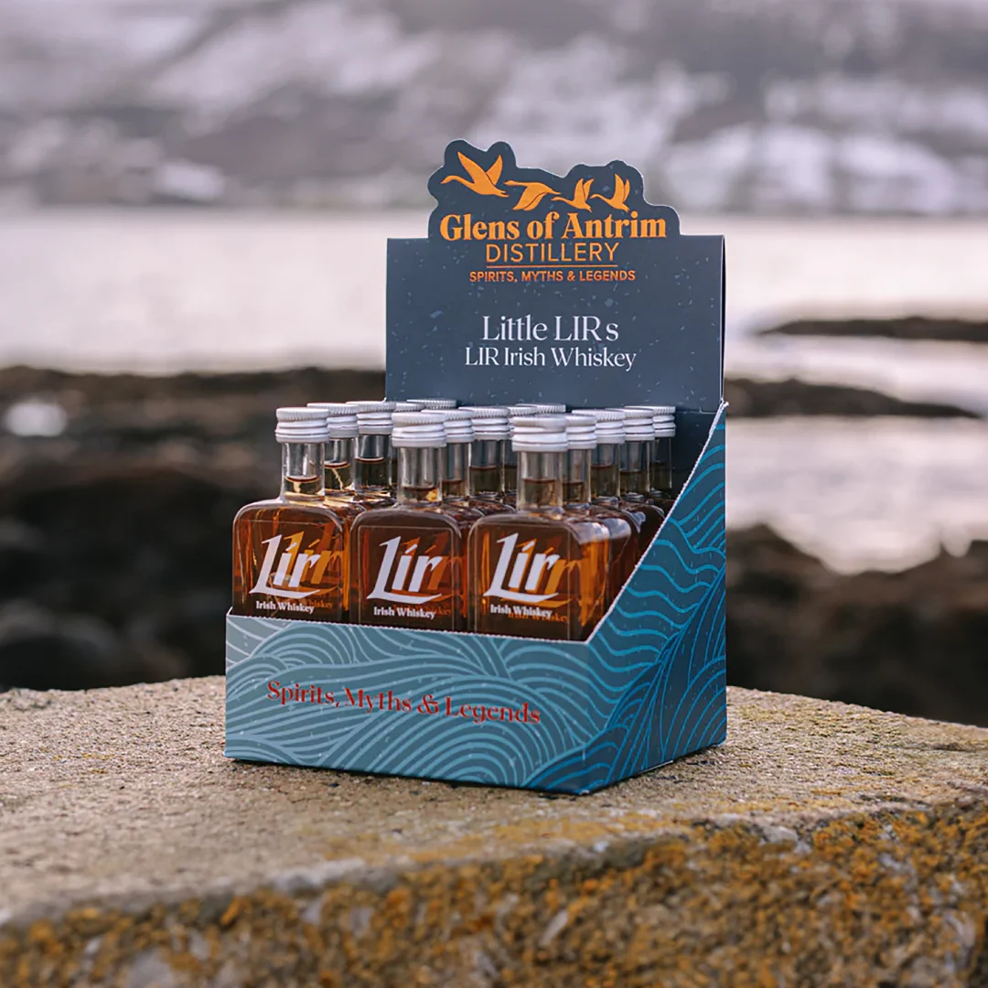
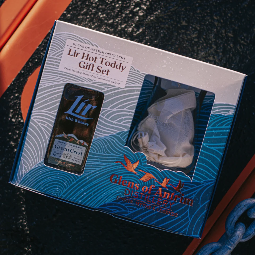
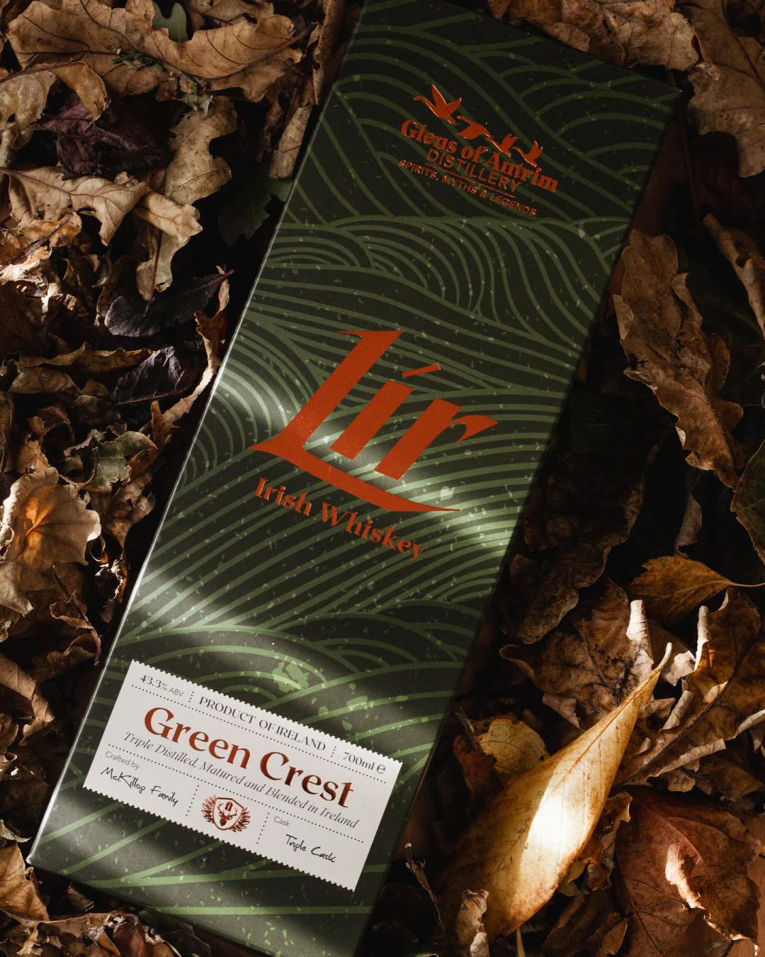
While rooted in tradition and myth, the Lir Irish Whiskey brand had to convey a modern, dynamic identity to appeal to a younger audience. The brand’s visual identity subtly references Irish heritage, with the logo’s typography evoking the shape of a swan. By positioning the brand mark at the centre of the bottle, we created the illusion of a swan, seemingly surrounded or isolated by the sea.
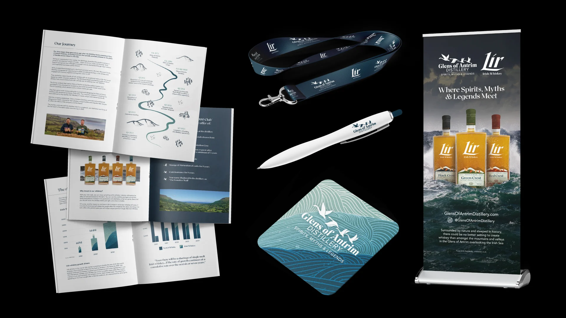
The brand imagery drew inspiration from the tumultuous seas in the Children of Lir story. These dynamic waves became a key visual element across all creative assets, reinforcing the Lir brand’s connection to the mythical tale and adding depth to the overall storytelling.
Delivering results for