
Keys, phone, money, cup: designing a campaign to make reuse second nature
By Nathan Warnock, Senior Graphic Designer
Like a lot of people, I didn’t realise that most takeaway coffee cups aren’t easily recyclable. I had used them plenty of times, then put them in my recycling bin at home, assuming I was doing the right thing. The reality is more complicated. Many disposable cups, even those that look like paper, have a plastic lining to make them suitable for hot drinks. That lining makes them extremely difficult to recycle, meaning many ultimately end up as waste.
When we were appointed by the Department for Agriculture, Environment and Rural Affairs (DAERA) to create a campaign to address this very issue, we knew that we would have to challenge this assumption if we wanted to drive behavioural change. During our initial briefing with DAERA, we explored the scale of the problem and the wider impact of single-use products on waste, pollution and the environment. We also learned something important about tone. Previous messaging with negative connotations, or language that felt too finger-pointing, hadn’t always landed with people in the way intended.
So, the challenge became, how do we encourage people to think differently about single-use cups without making them feel judged?
Turning behaviour change into a simple checklist
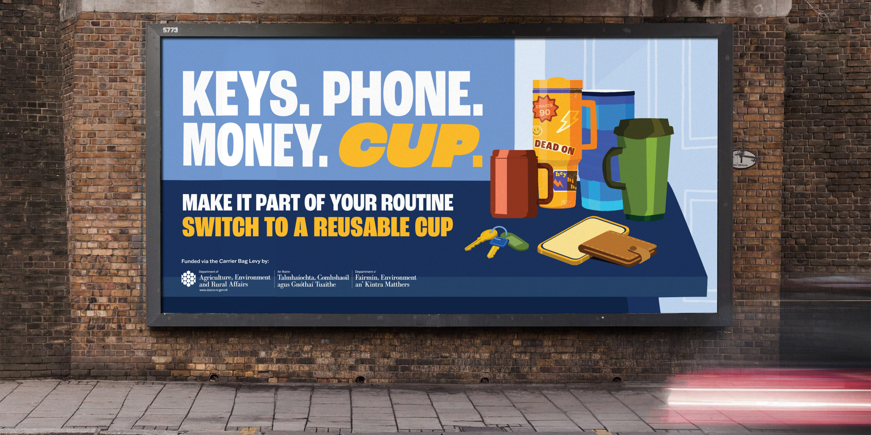
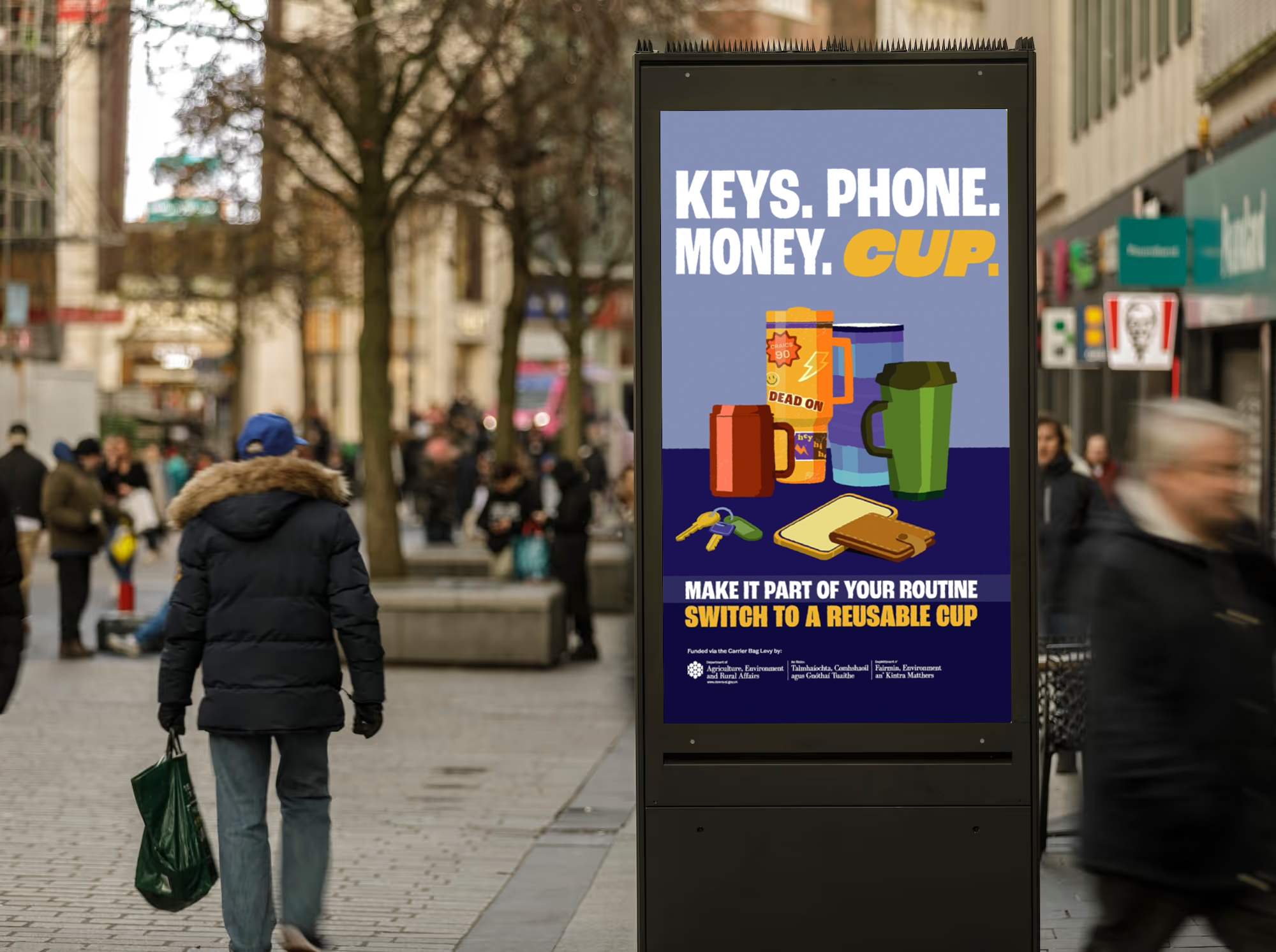
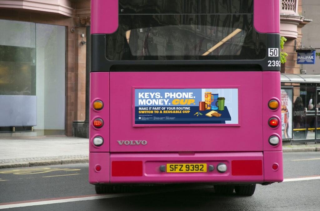
Our concept, “Keys, Phone, Money, Cup”, was built around a familiar mental checklist: the quick scan most of us do before leaving the house.
Keys? Phone? Money?
By placing a reusable cup alongside the everyday essentials, the campaign made the action feel simple, memorable and achievable. It’s about adding one small item to a routine they already have. It made reuse feel normal, easy and instinctive, rather than something that required a big conscious effort.
Visually, the campaign needed to work across different outputs and locations across Northern Ireland. We created a 30” animated ad that used rhythm, repetition and light humour to show people from different everyday settings realising that one thing was missing: their reusable cup.
We knew the campaign needed to stand out quickly, especially on fast-moving social feeds, the animation was designed to feel bright, bold and instantly engaging. Colour, pace and movement all played an important role, with fast cuts and eye-catching scenes helping to hook the viewer early and keep the message moving.
Sound was also a key part of the idea. The audio track and voiceover helped give the campaign its rhythm, with the repeated “Keys, Phone, Money, Cup” line becoming almost like a beat. The music took inspiration from early 2000s electronic dance, using a fast, bouncy synth-led feel that matched the tempo and repetition of the concept.
Beyond the animation, the campaign also needed to hold its own in static formats. Because the work was appearing across billboards and bus rears throughout Northern Ireland, the final frame had to act almost like a standalone poster. That gave us a strong visual foundation to adapt across print and outdoor media, keeping the campaign recognisable whether someone saw it moving on a screen or passing it on the road.
The repeated structure helped create a memorable cue. The aim was for people to see the campaign and carry the phrase with them in real life, especially at the moment they were leaving the house.
Designing for reach, recognition and real-world behaviour
For a campaign like this, visibility was key. The creative needed to be bold enough for billboards, clear enough for digital formats and engaging enough for social media.
The campaign ran across outdoor, digital outdoor and paid social channels, reaching both urban and rural audiences across Northern Ireland. Outdoor placements included large-format billboards, transit advertising and digital towers, with some digital activity placed in retail environments where hot drinks are sold.
That mix of media helped the idea appear close to the behaviour we were trying to influence. Seeing “Keys, Phone, Money, Cup” while commuting, stopping for fuel, passing through town or scrolling on your phone helped reinforce the message in the right moments.
The campaign ran over a two-week period aligned with Earth Day, helping connect the everyday action of bringing a reusable cup to a wider conversation around waste prevention and reuse.
The impact
The campaign achieved strong visibility across Northern Ireland. Outdoor and digital outdoor activity was estimated to reach approximately 50–65% of adults 18+ over the campaign period, while the paid social campaign reached 371,823 people, generated 922,837 impressions and achieved 867,312 video views.
For a behaviour-change campaign, those numbers matter because repetition matters. A message like this works best when people encounter it more than once, across different parts of their day. The more familiar the phrase becomes, the more likely it is to become part of someone’s own routine.
A small change with a lasting idea
The key insight that we unlocked when working on this campaign was that the answer wasn’t to make people feel guilty. It was to make the better choice feel easier.
“Keys, Phone, Money, Cup” works because it takes an environmental message and turns it into something practical. It gives people a simple phrase to remember and a small action they can repeat. This campaign was a reminder that creative design can play a meaningful role in behaviour change. It can make an issue more visible, make a message more memorable and help turn a good intention into an everyday habit.
And hopefully, the next time someone reaches for their keys, phone and money, they’ll remember one more thing before they leave the house: their cup.